Quote:
Originally Posted by firstgenaddict

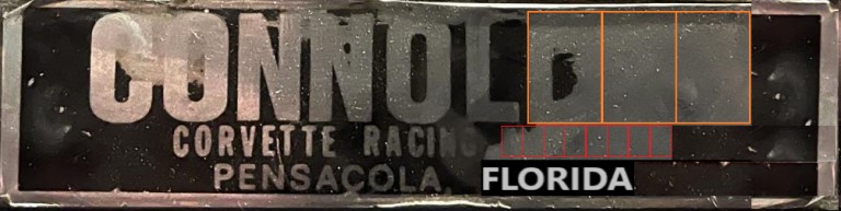
I believe the next letter is another L
The negative area (black) of the O and C are narrow and I would expect the D to have a thin center. The black area represented in the questioned letter is much wider than the center of the O or C.
ADDITIONALLY the width of all the letters is the same... if you put a D there the actual character would be wider than any of the other letters in CONNOL
Maybe CONNOLLY, but that would still put the first line off center.
To make it center justified there really needs to be 3 letters after the first L.
|
This is a duospace font where punctuation and the letter 'I' for example are half width. I agree the top line is likely missing 3 letters. The last part of the second line should hold up to eight full width, assuming its centered under the first. My guess is 'MACHINES' using 7.5 and Florida centers the third line nicely as expected. Simply filling in the decal's missing right margin makes it much easier to see.
Can I have a vowel please, Carol?
")

 02-07-2022, 03:10 AM


 Threaded Mode